Difference between revisions of "Benchmarking & Scaling Tutorial/Results"
| Line 137: | Line 137: | ||
for x,y,label in zip(nprocs, speedup,["5NM","10NM","15NM"]): | for x,y,label in zip(nprocs, speedup,["5NM","10NM","15NM"]): | ||
ax.annotate(label, xy=(x,y), textcoords="offset points", xytext=(-12,10)) | ax.annotate(label, xy=(x,y), textcoords="offset points", xytext=(-12,10)) | ||
| + | |||
| + | fig.savefig("weak_scaling_plot.png", dpi=300) | ||
</syntaxhighlight> | </syntaxhighlight> | ||
| Line 143: | Line 145: | ||
</div> | </div> | ||
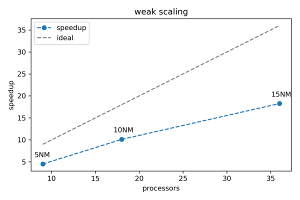
| + | The resulting figure can be seen below. As expected a real-world example does not behave as perfectly as predicted by Gustafson's law. However, we can still observe a close to linear behavior. | ||
| + | |||
| + | [[File:Weak_scaling_example.png|600px]] | ||
| + | |||
---- | ---- | ||
'''Previous''': [[Benchmarking_%26_Scaling_Tutorial/Automated_Benchmarking | Automated Benchmarking using a Job Script ]] | '''Previous''': [[Benchmarking_%26_Scaling_Tutorial/Automated_Benchmarking | Automated Benchmarking using a Job Script ]] | ||
Revision as of 12:14, 11 March 2022
| Tutorial | |
|---|---|
| Title: | Benchmarking & Scaling |
| Provider: | HPC.NRW
|
| Contact: | tutorials@hpc.nrw |
| Type: | Online |
| Topic Area: | Performance Analysis |
| License: | CC-BY-SA |
| Syllabus
| |
| 1. Introduction & Theory | |
| 2. Interactive Manual Benchmarking | |
| 3. Automated Benchmarking using a Job Script | |
| 4. Automated Benchmarking using JUBE | |
| 5. Plotting & Interpreting Results | |
Weak scaling
The results for the weak scaling example were obtained by running the simulation for the 5NM, 10NM and 15NM systems using using 9, 18 and 36 cores, respectively. A serial run with one core for each system was performed as a reference. Each run was repeated five times. The bash/job script can be found below:
#!/bin/bash

# Load all needed modules (adjust to your specific site!)
module load GROMACS

GMX="gmx_mpi -nobackup -quiet mdrun -nsteps 10000 -ntomp 1"

GMX5="${GMX} -deffnm MD_5NM_WATER"
GMX10="${GMX} -deffnm MD_10NM_WATER"
GMX15="${GMX} -deffnm MD_15NM_WATER"

echo "# Cores Time/s"
for N in 1 9; do
    for i in $(seq 5); do
        START=$(date +%s.%N)
        srun -n $N $GMX5 > gromacs.log 2>&1
        END=$(date +%s.%N)
        RUNTIME=$(echo "$END - $START" | bc -l)
        printf "%3d %5.2f\n" $N $RUNTIME
    done
done

for N in 1 18; do
    for i in $(seq 5); do
        START=$(date +%s.%N)
        srun -n $N $GMX10 > gromacs.log 2>&1
        END=$(date +%s.%N)
        RUNTIME=$(echo "$END - $START" | bc -l)
        printf "%3d %5.2f\n" $N $RUNTIME
    done
done

for N in 1 36; do
    for i in $(seq 5); do
        START=$(date +%s.%N)
        srun -n $N $GMX15 > gromacs.log 2>&1
        END=$(date +%s.%N)
        RUNTIME=$(echo "$END - $START" | bc -l)
        printf "%3d %5.2f\n" $N $RUNTIME
    done
done
The results are listed below:
# Cores Time/s
  1 62.58
  1 62.46
  1 61.90
  1 62.06
  1 62.33
  9 13.52
  9 13.50
  9 14.99
  9 13.61
  9 13.42
  1 533.24
  1 528.78
  1 527.26
  1 538.61
  1 532.99
 18 53.02
 18 52.34
 18 52.60
 18 52.00
 18 53.11
  1 1881.80
  1 1871.87
  1 1867.41
  1 1864.70
  1 1864.01
 36 102.71
 36 101.77
 36 102.08
 36 102.98
 36 102.36
We can write a simple Python script to process and plot the resulting data. For this purpose we are making use of the numpy and matplotlib Python libraries. You can of course use any other software to visualize the results.
Example Python script to plot weak scaling results:
#!/usr/bin/env python3

import numpy as np
import matplotlib.pyplot as plt

data = np.loadtxt("results_weak_scaling.dat")

# Different set every 10 data points (5 serial + 5 parallel)
wat05 = data[0:10]
wat10 = data[10:20]
wat15 = data[20:30]

wat = [wat05, wat10, wat15]

# Calculate the mean times for every set
stimes = []
ptimes = []
for d in wat:
    stimes.append(np.mean(d[0:5], axis=0))
    ptimes.append(np.mean(d[5:10], axis=0))

# Re-transform to numpy array
stimes = np.asarray(stimes)
ptimes = np.asarray(ptimes)

# Calculate speedup
speedup = stimes[:,1]/ptimes[:,1]

# Get the No of processors
nprocs = ptimes[:,0]

# Plot
fig = plt.figure()
ax  = fig.add_subplot(111)
ax.plot(nprocs, speedup, '--o', label="speedup")
ax.plot(nprocs, nprocs, '--', color='gray', label="ideal")
ax.legend()
ax.set_xlabel("processors")
ax.set_ylabel("speedup")
ax.set_title("weak scaling")
for x,y,label in zip(nprocs, speedup,["5NM","10NM","15NM"]):
    ax.annotate(label, xy=(x,y), textcoords="offset points", xytext=(-12,10))

fig.savefig("weak_scaling_plot.png", dpi=300)
The resulting figure can be seen below. As expected a real-world example does not behave as perfectly as predicted by Gustafson's law. However, we can still observe a close to linear behavior.
